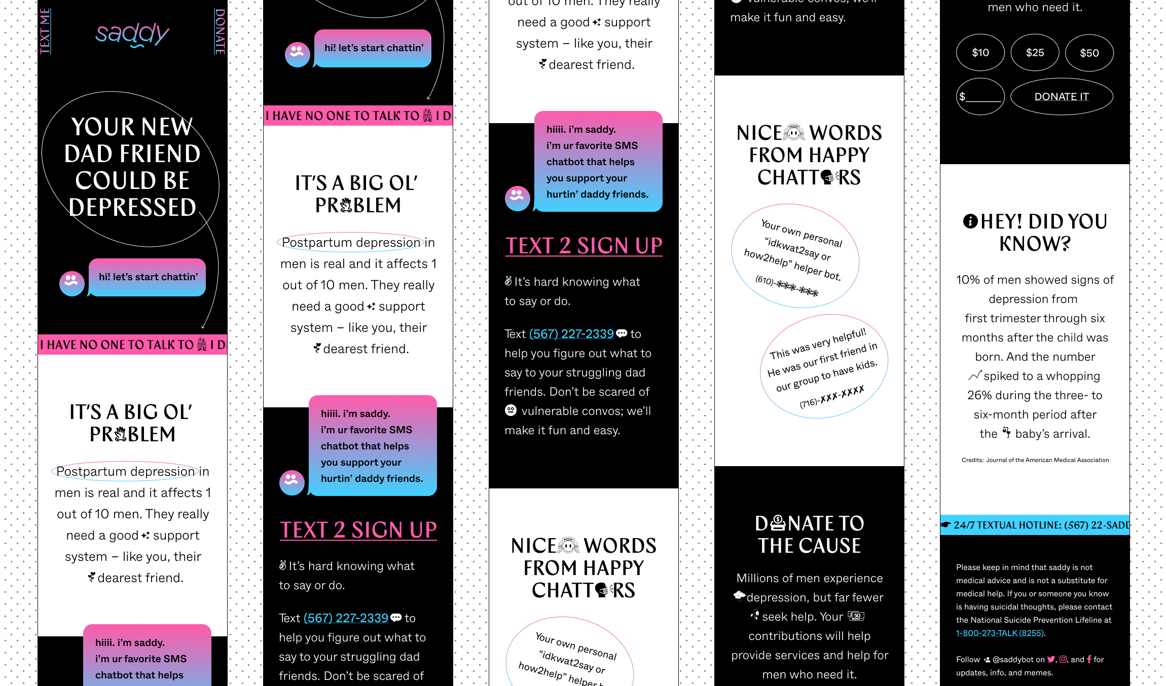
Prototype: saddy
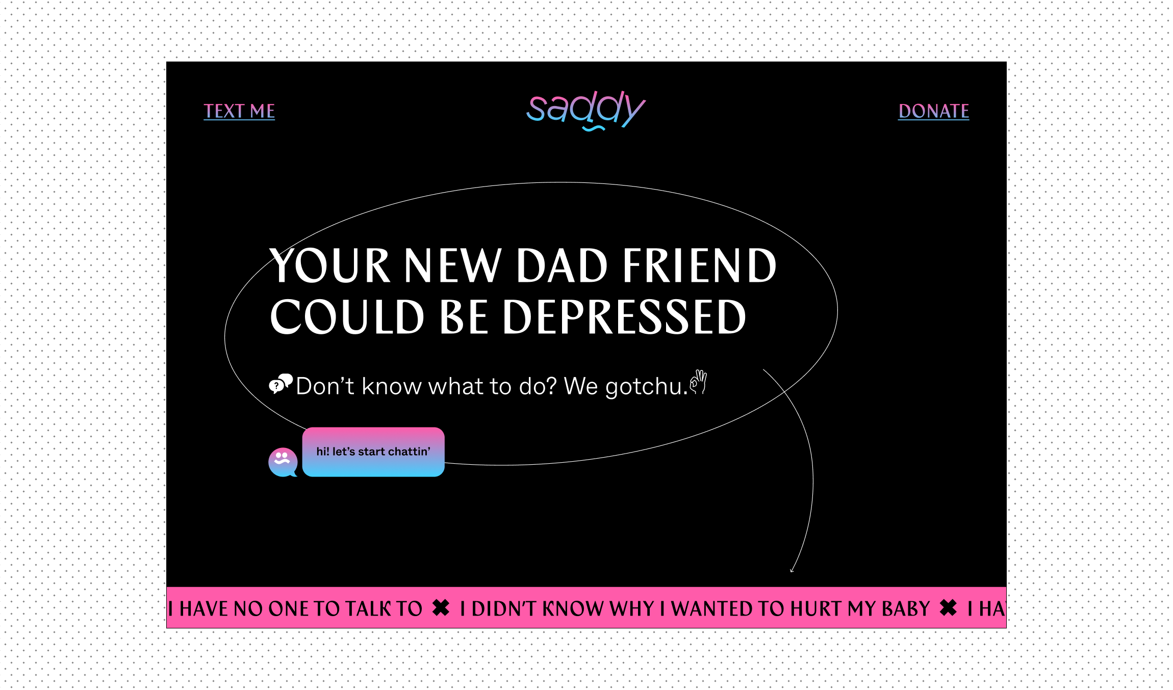
Saddy is a chatbot that guides friends on how to help struggling new dads. Men’s mental health is a challenging topic, so I wanted to make it easy to chat about.
UI/UX, BRANDING, CHATBOT, (UNDER DEVELOPMENT)
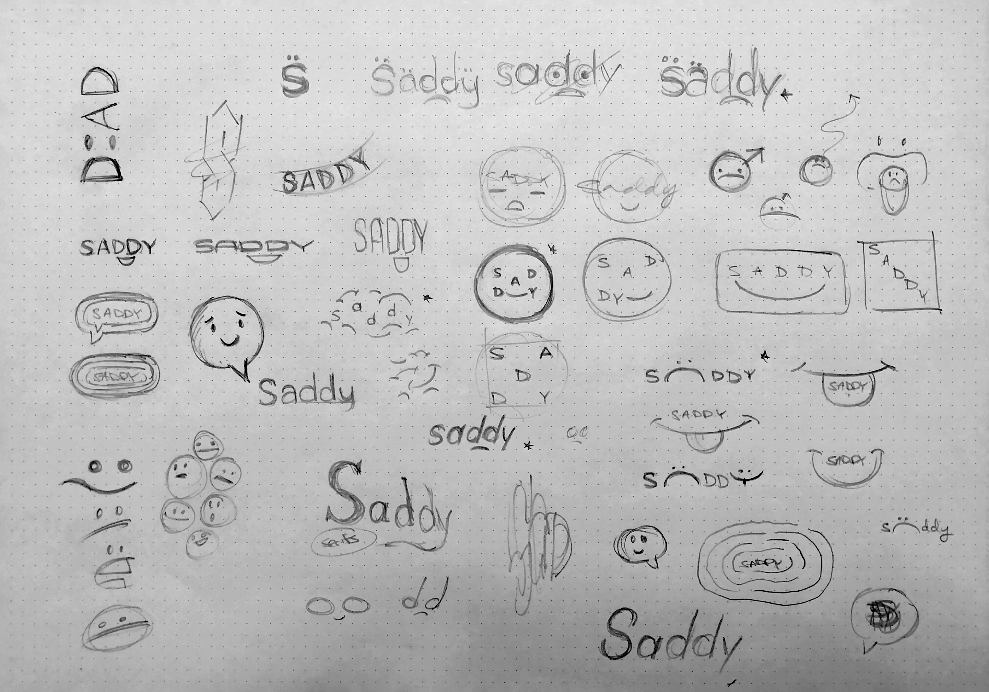
sketches
About the Project
Millennial dads take on more parenting responsibilities than their fathers before them, but the support for today’s dads is still a generation behind. So I created an accessible and educational service to help bring that much-needed support system to new dads.
Dad interviews
Research and Problems
︎ Hard Opening Up
Emotional communication is uncommon and uncomfortable for men, even among close friends. The perception of needing to “just suck it up” and be stoic is the cause.
︎ Experience Disparity
Younger people encounter information about postpartum depression for moms but rarely investigate it until life events drive them to do so. And in general, people aren’t sure or don’t know how to help a depressed person.
︎ Far Communication
Chatting through text or social media is inherently shallow. There are more and more features that allow users to communicate quickly at the cost of meaningful interaction. For example, you can simply respond to a post or text with a suggested emoji from a single interaction. However, that is how many communicate, so I found opportunities to use this to my advantage. Distanced communication can provide a low-pressure, safe space for people who struggle to discuss emotions in a person.
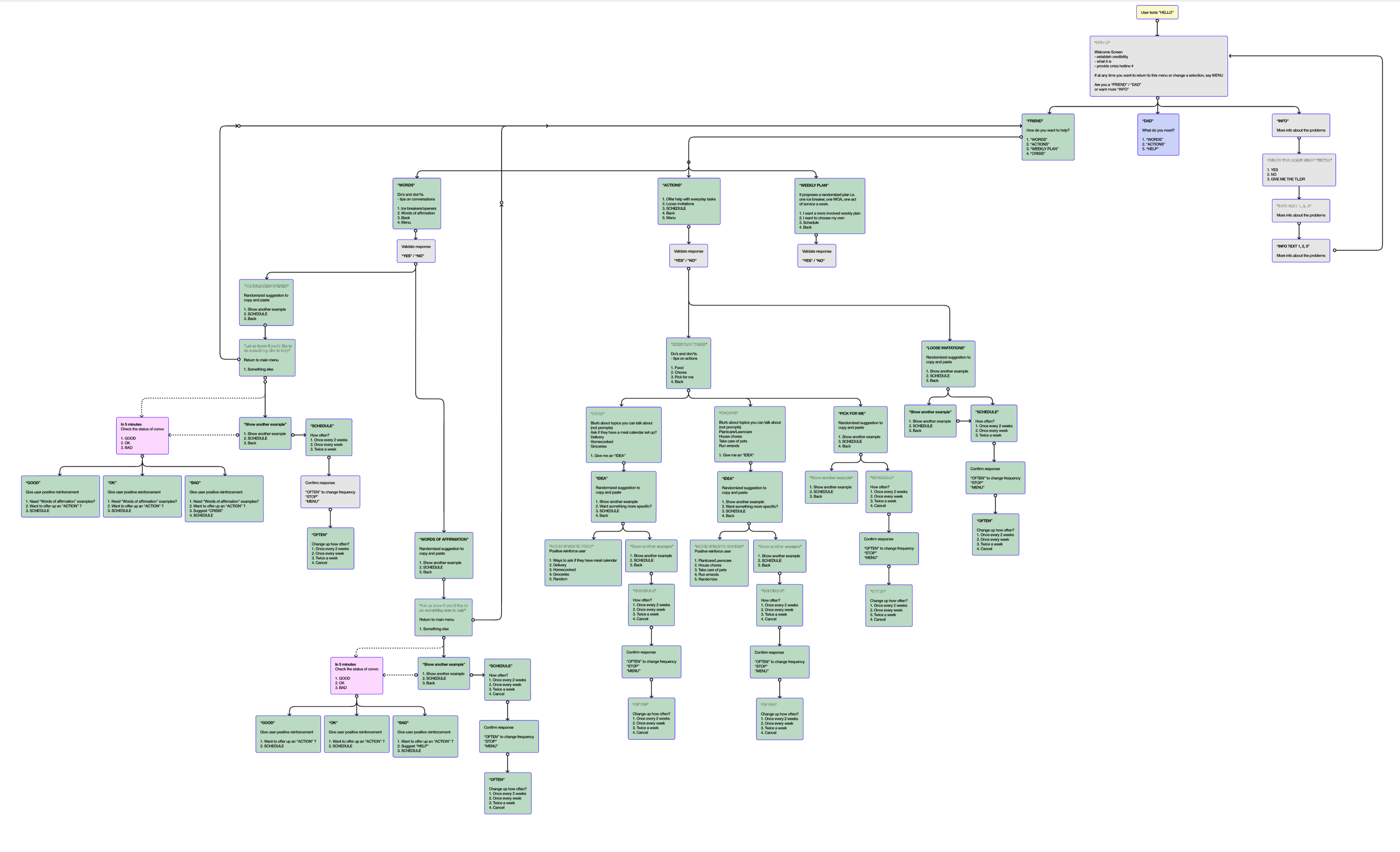
early iteration of chat script flows
UX Solutions
The goal of Saddy is to be as convenient as possible so I delved into competitive research. What I found was that the majority of mental health awareness campaigns for men are similar to traditional charity awareness campaigns. A marketing strategy is used that focuses on a landing page to showcase long-form video content with a call-to-action to spread awareness and to donate. Best practices show that the dropoff rate of videos is too high for meaningful retention and understanding. An opportunity for a low barrier of entry was the use of an SMS chatbot that would allow the brand to be easily available.
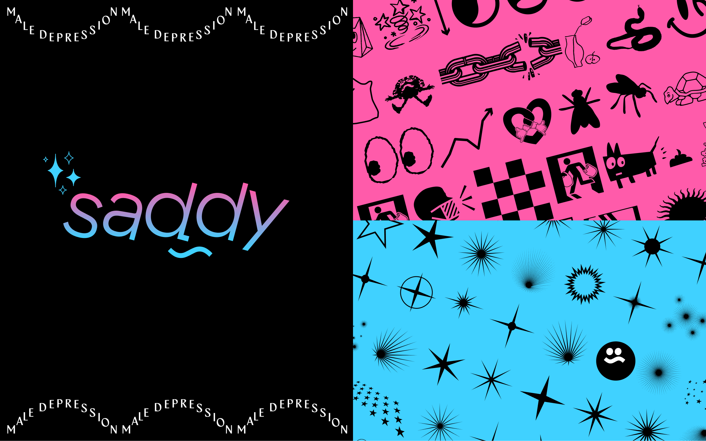
︎ Branding fun fact: Sad + Daddy = Saddy!
︎ Friends of new dads who don’t know what to do or how to help.
︎ New dads who don’t know where or how to get help.
I made sure the user journey was straightforward via the chat prompts. The “Friend” suggestions range from taking action (through acts of service) to reminders (checking up on those who are struggling). The “New Dad” suggestions range from scheduling words of affirmation to simple daily mood journaling.
brand guidelines (︎︎︎ Interactive)
Design Problems
The category is also filled with clichéd black-and-white photos of men sitting by themselves. I made an intentional decision to communicate solely through fun visuals and copy.
I wanted to make sure it has a light and quirky personality with a striking and memorable counter-cultural look.
Logotype, logomark, and dingbats
Design Solutions
I wanted to ironically counter masculinity and baby gender norm colors with the neon pink and blue color palette. When designing the wordmark, I wanted to symbolize the uneasiness and unbalanced feelings new dads experience. The bold geometric typeface was an intentional decision that creates a sense of fun. Glyphs and other graphic elements reinforce the copy and help visualize that this is meant to be fun. This light-hearted casualness is a pillar of the brand personality and tone of voice.